Data Science, A Talking Dog, and Alphabet Soup

Rusty Bresser
Have you ever wondered if some letters in our alphabet are used more or less than other letters? Think for a few seconds, and make a guess. If you wanted to find out, what would you do? Most likely, you’d collect, organize, represent, and analyze the data in some way and then compare the results with your predictions. You might even need to collect more data if your sample size is too small. All these activities are key to making sense of data, one of the most important yet undervalued content areas in schools today.
Shifting the Focus
In his book Aftermath (2025), education advocate Ted Dintersmith proposes changes in how we teach mathematics, shifting the focus from rote memorization to emphasizing estimation, prediction, creativity, problem solving, statistical reasoning, curiosity, relevance, and joy. If we do this, he says, “we’ll produce young adults with the math competencies that help them, their communities, and our democracy thrive.”
In this post, we’ll explore a lesson that begins with a question, takes students through a data experiment, and ends with a story about a talking dog, exposing math’s relevance, creativity, and joy!
In the Classroom with Fifth Graders
Back to our question at the start of this post. Which letters are used more or less than other letters (in English)? What do you think? Math (and science) usually begins with a question, and mathematicians (and scientists) must figure out a way to the answers. I decided to visit my friend and colleague Nilu Karunasiri’s fifth grade class to see how they would respond to the question about letter frequency.
Posing a Question and Eliciting Predictions
I began the lesson by gathering Nilu’s fifth graders on the front rug area. Holding up a book, I asked, “If I open this book to a page and look at the letters, do you think there will be some letters in the alphabet that occur more often? Less often? If so, which ones?”
After giving them time to think, students paired up and shared their predictions. After a minute or so, I called them back for a short discussion about letter frequency. Some students thought the vowels would show up more often. Some predicted other letters like c, t, h. Others seemed to be aware that letters like z, w, and y would appear less frequently. Asking students to make predictions in math (and in science or language arts) gives them a stake in the results, motivating them to engage with the content.
Next, I picked up the book Martha Blah Blah by Susan Meddaugh, opened to a page at random, and read aloud a sentence for Nilu to copy on her data collection sheet and model how to create a line plot (see below).
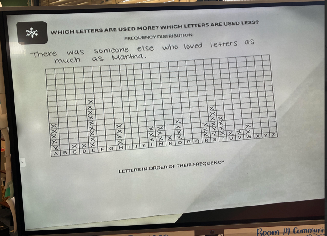
Students Collect and Analyze Data
Then, it was the students’ turn to collect data. As they made their way back to their seats, each student grabbed a book, a data collection sheet (access the sheet here), and got busy collecting data.
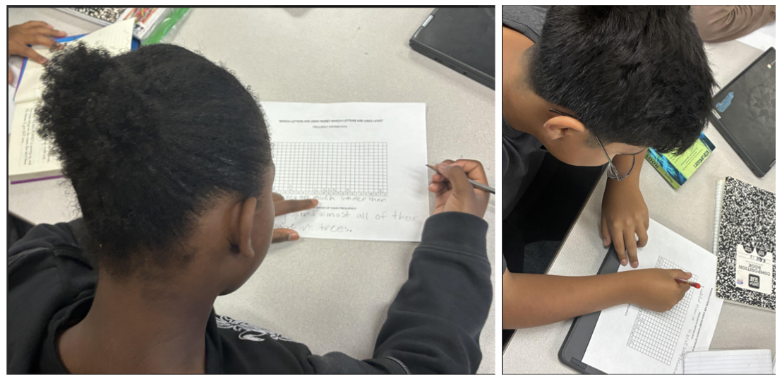
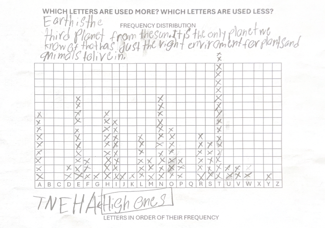
This student noted his top five letters after completing his line plot (see below).
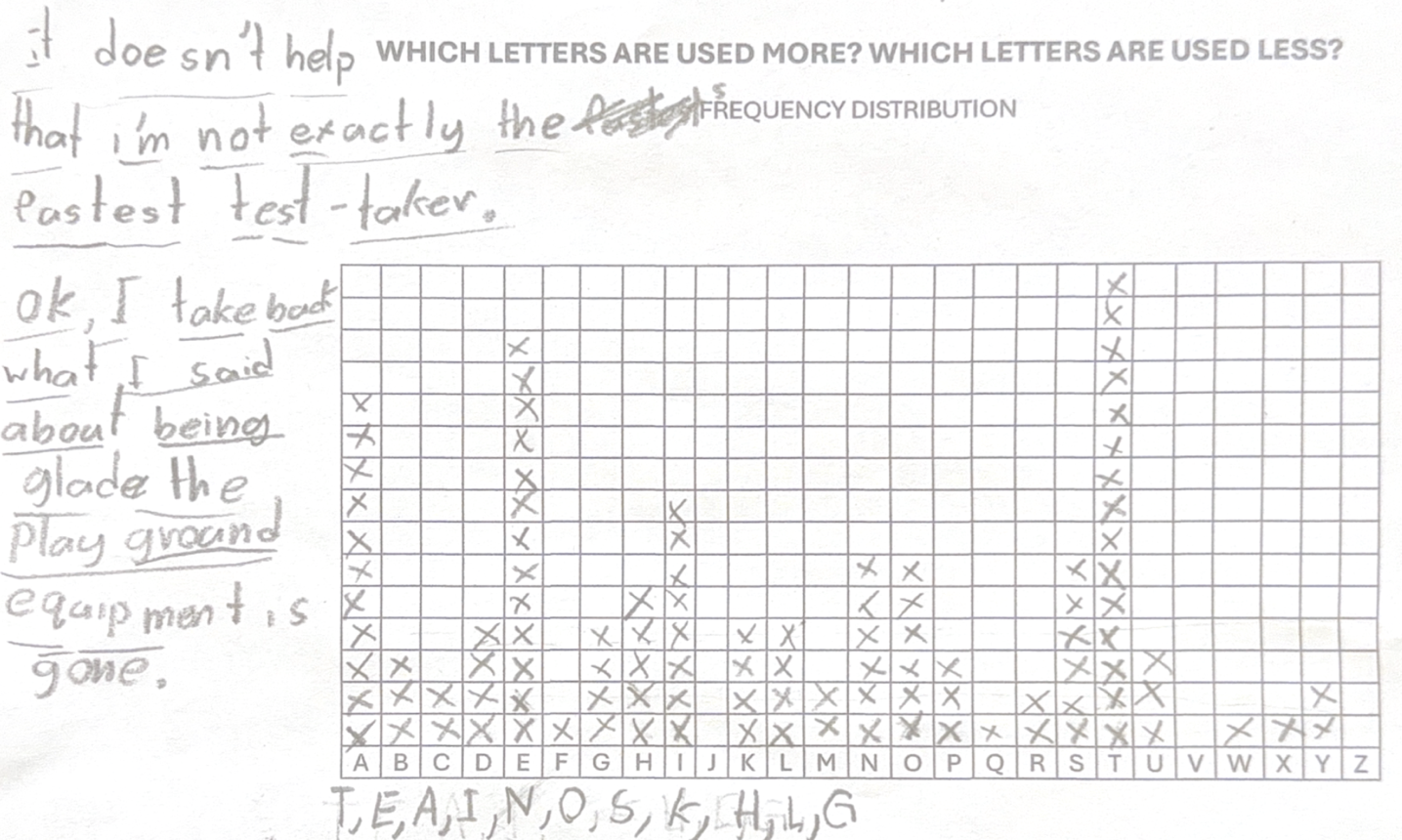
This student (see below) put all the letters in order starting from the left with the most frequent to the least frequent.
After completing their line plots, students shared what they noticed. Many reported that their predictions matched the outcomes in the experiment. Others were surprised at the frequency of some of the letters, like T and H. And a few commented that some letters were equally likely to occur, such as O and I.
Making Connections to Decimals, Fractions, and Percents
After our class discussion, Nilu gathered the class back together on the front rug while I posted the following graph by 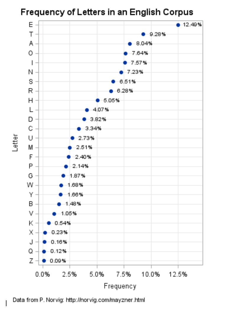 Rick Wicklin, distinguished researcher in computational statistics. I could tell from the oohing and aahing that the students hadn’t seen a graph like this before, and they were impressed that a researcher would also be interested in finding out which letters were used most frequently. In fact, even Samuel Morse had to answer this question when he invented the Morse Code!
I asked the class a series of questions about the graph, using partner talks to increase participation. My intention was to find out if students could read and understand the graph, make connections to their experiment, and see what they knew about decimals, percents, and fractions. Aside from the questions below, I was also interested in finding out whether they knew that a percent means ‘out of 100’. Would they be able to connect fractions to percents? Would they have a sense of the meaning of the decimal numbers? Here are some of the questions I posed:
- What do you notice?
- How does the data on the graph compare with what you discovered?
- Which letters occurred the most? The least?
- Which letters occur less than one percent? How do you know?
- What does 12.40% mean?
Creating a Context for the Data Science Experiment
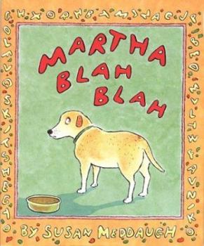 To create a context for our data science experiment, I read aloud the book Martha Blah Blah by Susan Meddaugh (1998). Launching the lesson by reading the book is a great idea, but in this case, reading the book at the end of the lesson made sense because it gave students a chance to apply what they’d learned about letter frequency.
For those of you who aren’t familiar, Martha is a dog who is able to talk as the result of eating a bowl of alphabet soup every day. But one day, when Granny Flo inherits the soup company, she immediately fires thirteen of the twenty-six pasta letter makers for the sake of bigger profits. This is a big problem for Martha. When she eats her alphabet soup from the new cans, she’s unable to make any sense because of the thirteen missing letters! For example, when Martha tries to say, “Good soup today!” it comes out sounding like, “Goo oup o!”
Nilu’s fifth graders enjoyed the book, and following the story I asked them to think about which letters they would keep to make sure that Martha would make sense when she spoke. Which letters would they get rid of if they had to? These questions gave students the opportunity to use the data they’d collected and learned about to support their argument.
Making Sense of Data
Making sense of data in our complex world is becoming an essential part of life, and being able to analyze and understand what data is telling us is crucial to being an informed citizen. As Jo Boaler notes, “The need to analyze and interpret data is no longer confined to engineering and computer programming; it has become an essential life skill (youcubed.org).”
So, the next time you’re tasked with teaching data science, bring along a talking dog and some alphabet letters. I know your students will thank you for it!
Thank you, Nilu, for welcoming me into your classroom, and a big thanks to your fifth graders for their enthusiasm and willingness to try something new!